

Answering the “What and Why” of Performance Bottlenecks

I’ve seen it time and time again. SteelCentral APM users are finding and fixing application performance issues faster than ever thanks to Performance Graph and TruePlot. I’ve been a fan of these analytics features since their inception.
 Performance Graph is a flow diagram that links transaction types with their associated back-end packages, code, and SQL calls to provide a quick visual representation of potential bottlenecks. Performance Graph shows the total processing time and/or financial impact of transaction types proportional to other transaction types so you know where to focus your optimization efforts. The ability to assign a financial weight or importance to key transactions helps you focus your efforts on what is most important to the business—not just what might be slow.
TruePlot is a scatter plot of transaction response times. Each dot represents the response time for a transaction. The color coding helps to highlight performance characteristics of the nodes or instances that comprise the environment.
These analytics are only possible thanks to Riverbed’s big data approach to APM. Without detail on every transaction, performance data only represents some percentage of the truth. Only a high definition data set can provide a true picture of your performance trends, anomalies, and other issues.
An example where I used them together at a customer site to quickly point to what was slow and why
In this case, we only instrumented the initial application tier. The downstream application tiers the application depended on were not instrumented. Though there were performance issues, the team handling the downstream systems insisted the bottleneck was not in their environment. (Sound familiar?)
Using Performance Graph, we quickly saw that the slowdown was caused by the JMS call going to the downstream servers.
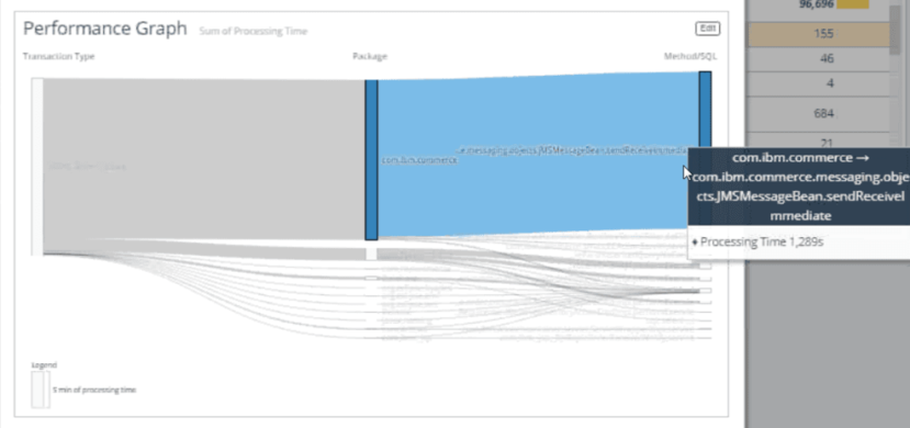
Performance Graph: Visualizing your application’s flow. In this case, sendReceive is our longest method.
Using TruePlot, we saw all four application servers experiencing the same issue proving the issue was not a single server resource issue as the downstream team suggested.
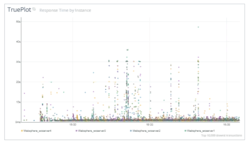
TruePlot: Each dot represents an individual transaction. In this example, the colors represent the four application servers.
Where Performance Graph shows us what is slow, TruePlot shows us why it is slow. Patterns are usually indicative of issues. Horizontal, vertical and diagonal lines all point to performance problems. Vertical lines like these tell us that the downstream tier is blocking the execution of our requests. When the block clears, all our requests complete at the same time, hence the straight line. The fact that the vertical lines are multi-colored tell us the issue is happening on all four of our application servers.
The team using SteelCentral AppInternals now had actionable information to share with the downstream team that pointed them in the right direction to resolve the issue.
It took longer to explain this in this post than it did for the customer’s application performance management team to identify the issue and to start addressing it.
Bottom line, when troubleshooting, these two analytics cards are powerful tools in your APM toolkit. Use them. Fix things. Make your applications shine.
Try it out for yourself in our pre-configured cloud-based instant access sandbox!